Does your data tell a story?
We help you visualise your Information like never before
We bring your data alive!
Bringing your data alive and giving it a human face
We blend data, science, human psychology, and aesthetics to create the best visuals that are easy to consume and interpret.
Humongous amount of data and information coming from various sources such as – pdfs, spreadsheets,forms,emails, databases and so on. Today’s, information boom deluges managers with tonnes of data making it hard to filter and focus on what is required.
Managers who want to leverage this data for meaningful insights do not think in terms of spreadsheets and databases. They think in terms of the goals of the company and the ways they can make a difference by leveraging the data treasure. They want an unmeshed data solution that can answer their questions.
Information is good but only if it can be interpreted
Neuroscience of visual perception
Why visualise data?
As per neurologists and psychologists, our brains are wired to absorb pictures and graphs far more than lines or tables. Spatial information reveals in a flash the whole situation. It informs the mind, awakens imagination, convinces and fuels our sub-consciousness to make decisions. AdroitBI takes special care to blend art and science together to paint the best picture of your customers.
We know human minds are designed to grasp visuals better than mere metrics in ordinary tables. We cherry pick information and design world class graphics that fuel successful decisions.
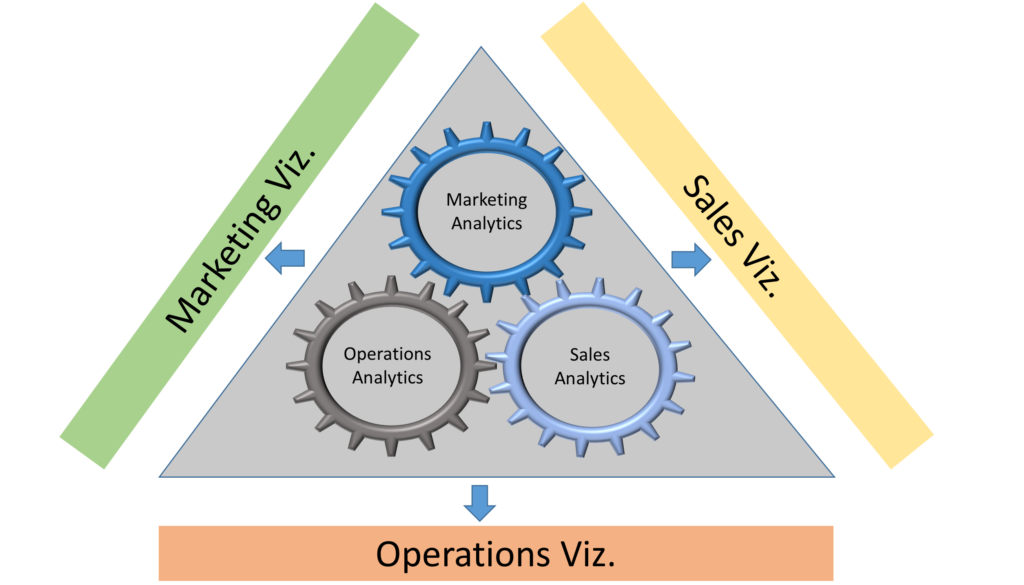
Visualise your customerData visualization is the presentation of data in a pictorial or graphical format. It enables decision makers to see analytics presented visually, so they can grasp difficult concepts or identify new patterns. With interactive visualization, you can take the concept a step further by using technology to drill down into charts and graphs for more detail, interactively changing what data you see and how it’s processed.
AdroitBI offers a human-centric data solution that assists you in leaping beyond intuitive decision-making.
“Visualise your customer” tells a vivid story about your customer that is also interactive. It readily draws attention to your strengths and weaknesses, calls out future opportunities and areas that can be improved. It makes complex and large amounts of data easy to consume and retain, making day-to-day and long term decisions easy.


